
P | pMD
A voice-first wellness companion for Apple Watch, designed before voice-AI was mainstream
In 2023, our CEO conceived of P, a wellness assistant with a distinct personality, and our SVP of Technology asked me to design the Apple Watch app that would bring it to life. The brief was specific: design the watch interface and interactions for a voice-driven AI assistant that could answer questions and guide users through short meditations.
This was before OpenAI shipped voice mode in ChatGPT, and before Anthropic shipped voice in Claude. P was among the first voice wrappers of ChatGPT to hit the App Store. Voice-first AI was a frontier most consumer apps weren't touching yet, and we were going to try it on the most constrained surface available: a watch.
I led the v1 design end-to-end across the Watch app, watch face complications, companion phone app, and brand. The work also established the design system and interaction patterns that would shape every future version of P. The app shipped to the App Store, where it holds a 5-star rating today.
The core design problem: there's no screen to fall back on.
Most AI assistants on phones can rely on a screen when voice fails. The Watch can't. A user lifts their wrist, talks to P, and listens for a response. The visual real estate is too small for fallback UI, and the interaction is too short for anything that doesn't feel immediate.
That constraint shaped every decision I made.
Designing the personality, not just the interface.
The hardest part of this project wasn't the visual design. It was the voice.
P's draw is the personality. Without a distinct identity, it's just another AI chat app on a wrist. In collaboration with our VP of Sales, I built P's brand and voice style guide to give the AI a character that users would actually want to talk to. The brand had to feel warm enough to invite a meditation, calm enough to use during one, and confident enough to answer a question without sounding hesitant.
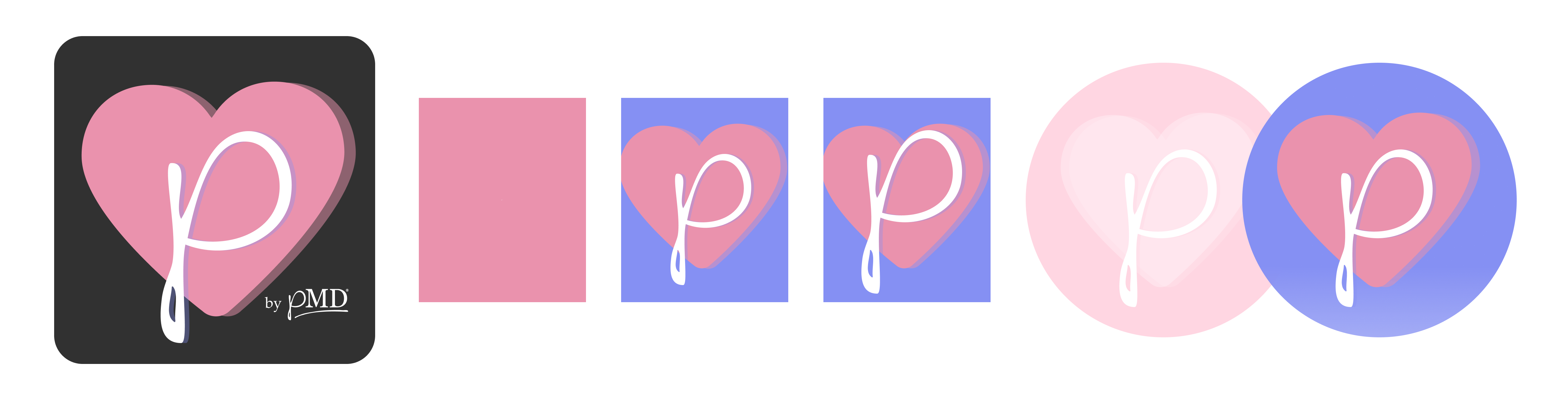
This was design work that doesn't show up as screens. It shows up in how P talks, how it pauses, how it sounds when it's thinking, and what it feels like when it responds.
Solving for AI latency on a watch.
P doesn't run an LLM natively on the Watch. The user's voice gets sent up, processed by the model, and a response gets sent back as voice. That round-trip takes time. Enough time that, without intervention, the user feels like nothing is happening.
The initial version of the app didn't have any "thinking" indication. I designed a pattern combining a subtle animation and a haptic rhythm to signal that P was processing. The haptics did most of the work. On a watch, users feel the device before they look at it, and the rhythm gave them a clear answer: P is working, just give it a second.
Designing for how users actually want to talk to AI.
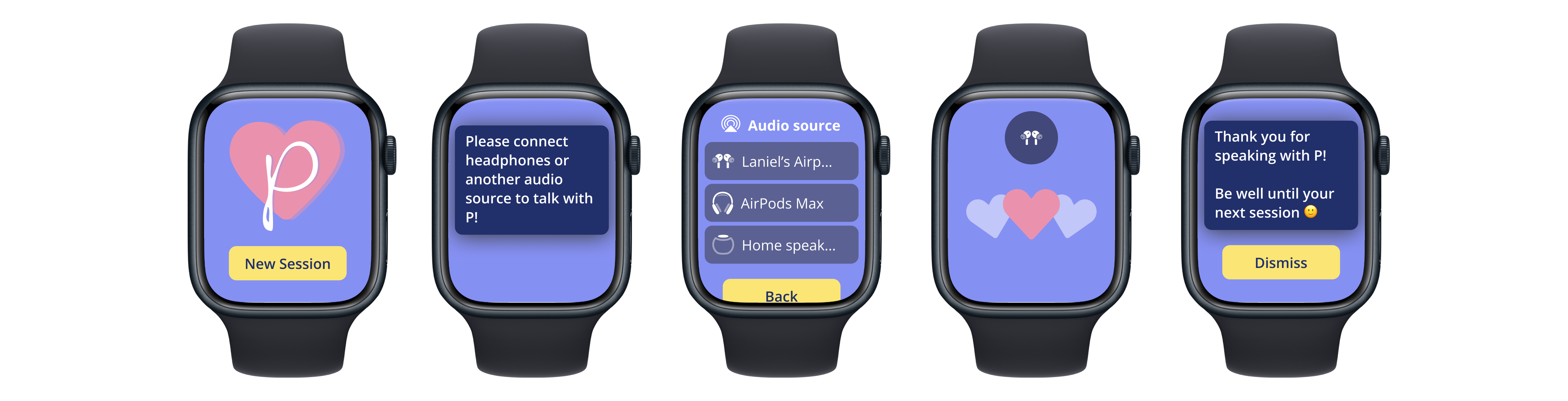
People don't always want to speak to their wrist out loud, and they don't always want P's voice playing through a watch speaker. Connecting to AirPods or other headphones was an obvious requirement, but the interaction for switching between speaker and headphones had to happen quickly, without breaking the conversational flow.
I designed a sliding drawer that surfaces the audio output selection at the right moments, letting users choose speaker or headphones without leaving the conversation. The drawer respects the constraint of the small screen and the priority of the voice interaction underneath.
Pushing back on the brief: the watch face complications.
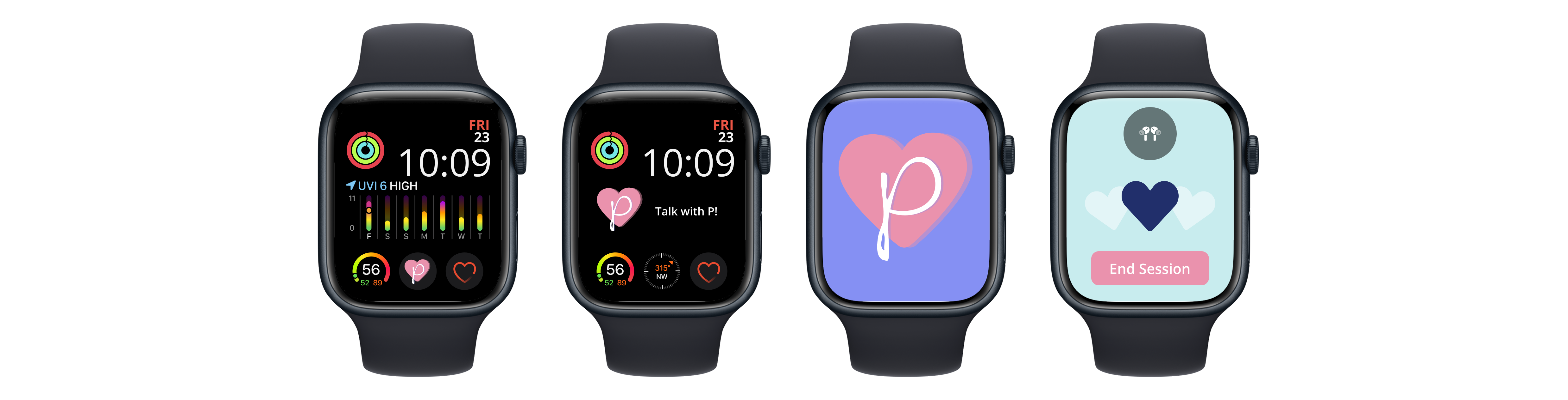
In the research phase, I tested how users actually access apps on their watch. The reality is that nobody opens watch apps from the app grid. They tap a complication on their watch face, or they don't use the app at all.
P needed to be a complication. Not a "nice to have" complication, but a primary one. Small enough to fit on a face with other things the user cares about, distinctive enough to recognize at a glance, and one tap from a full conversation with P.
I added watch face complications to the requirements and designed them in. This was the most visually present element of P on a user's day-to-day, and the most direct entry point to the experience.
Pushing back on the brief, again: adding the companion app.
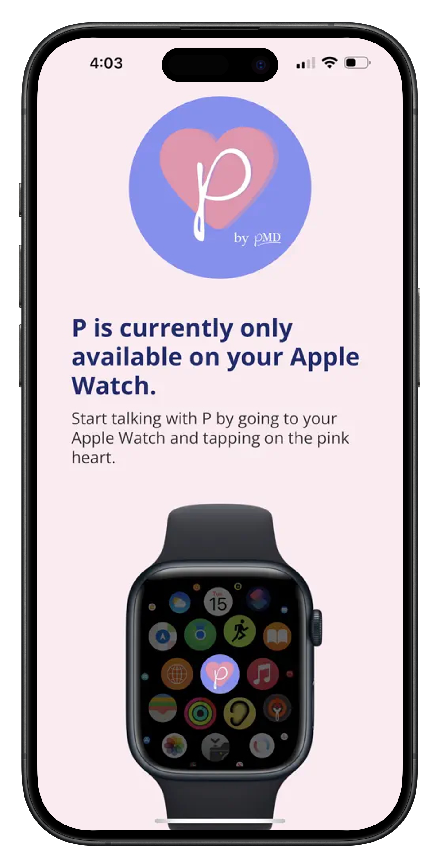
The original brief was Apple Watch only. As I researched comparable apps and tested early workflows, I realized that the Watch alone wasn't enough. Users needed an onboarding path. They needed somewhere to learn what P could do. The watch was the wrong surface for any of that.
I went back to the SVP of Technology and made the case for a companion phone app. Not a full app, just enough to onboard the user and direct them to the watch. The companion app got built. Onboarding became a meaningfully better experience.
These two moments (the complications and the companion app) were the design judgment moments for me on this project. The brief was wrong about scope twice, and the design process surfaced both gaps. The strongest design contribution wasn't the screens I made. It was recognizing the pieces of the system that weren't in the original ask.
Haptics as a core interaction medium.
For an app users mostly experience without looking, haptics became the primary feedback channel.
I designed distinct haptic patterns for the four key moments in a P session: when P begins to listen, when P is thinking, when P is responding, and during meditation breath cues that guide the user's inhale and exhale. Each pattern is recognizable on its own, so the user always knows what P is doing without looking at the screen.
The meditation use case was where haptics did the most work. A user starts a session, lowers their wrist, closes their eyes, and lets P guide them. The watch taps a rhythm matched to inhale and exhale. The screen doesn't matter during a meditation. The wrist matters.
Where it is now.
P shipped to the App Store with a 5-star rating. Adoption was modest at launch (voice-first AI on a watch was unfamiliar in 2023) but the product validated the approach. Internally, P is now being used heavily to track wellness stats across the company.
The initial v1 also included a desktop site, which I designed and worked with engineers to build. It was later sunset as the strategy refocused on the Apple Watch and App Store experience. The watch was where P's voice-first interaction was most immersive, and supporting a less-accessible desktop surface diluted that focus. Killing the desktop site was the right call.
Beyond shipping v1, I built the design system and interaction structure that future versions of P would be built on. This wasn't just a finished feature handed off. It was a foundation: the haptic vocabulary, the voice-first interaction patterns, the brand and voice style guide, the complication and companion app architecture. The junior designer I had hired and mentored took over continued iteration from there, building on the system I'd established. That handoff was part of growing them into pMD's lead product designer.

What this project taught me.
Three things.
First, voice-first interaction design is a different discipline than screen design. The mental model, the pace, the feedback channels are all different. Most product designers haven't had to think about this. The teams building AI products are going to need designers who have.
Second, branding and voice aren't separate from product design when you're designing an AI agent. They are the product. If the AI doesn't have a personality, the user has no reason to engage.
Third, the brief is sometimes wrong. The most valuable design contributions on this project weren't the screens I made. They were the arguments for the pieces that weren't in the original ask. That's the kind of design thinking I aim to bring to every design team I'm a part of.